The skill of accessorising an interior space is regularly confused as an ornamental add-on. It actually carries the potential to both affirm a space’s architectural purpose or subtly subvert it. Accessories are not an additional decorative layer. They are spatial punctuation marks, grounding mood, texture and function. Nevertheless, many interiors fail due to mistakes that look superficial but cumulatively disrupt the spatial composition.
Following are five of the most prevalent errors seen in modern home interiors and professional decor.
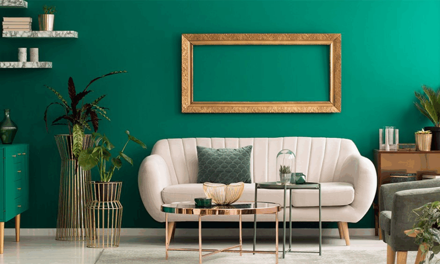
1. Cluttering the Visual Field

Picture Courtesy- Fern Kohler/ Pinterest
Perhaps the most common error in accessorising is an overabundance of filling surfaces. A console table is used as a launchpad for vases, frames, figurines and candles, competing for each other’s attention. Although each piece might be worthy on its own, their combined presence tends to overwhelm.
Visual clutter breaks up sightlines and spatial rhythm. It conflicts with architectural details such as architraves, skirting and wall treatment. Furthermore, clutter impacts the way light behaves in a room. Rather than permitting daylight or artificial light to dance across surfaces, it presents a broken surface where nothing reads well.
The secret is not minimalism but selective curation. Positive space between things allows each element to breathe and make a meaningful contribution to the whole language of the room.
2. Dropped Juxtaposition of Colours and Textures

Picture Courtesy- Pinterest
Merging tones and textures can make an environment richer, but it takes sensitivity to contrast and harmony. A rough jute mat with lacquered wood and metallic finishes could create a tactile clash instead of an interesting combination. An equally jarring combination could come from contrasting cold greys with warm terracottas without a transition in between, which can be jarring instead of harmonious.
Materials carry weight in tone and temperature. When textures or colors don’t align with each other or have no shared design language, the overall effect can be jarring. The best interiors usually borrow from a thoughtful material lexicon that respects the architectural finishes. For instance, an interior featuring exposed concrete walls might welcome warmer textures such as boucle or brushed linen to soften the starkness.
Where contrast is used sensitively, it raises the sensory level of a space. When used without discrimination, it upsets the material hierarchy.
3. Deviating from the Core Colour Palette

Picture Courtesy- Arch20
Each interior scheme has a prevailing colour direction, either derived from architectural finishes or through client briefing. To stray from that palette when accessorising is to undermine the spatial intent. An accomplished interior can be in the form of natural oak, subdued whites and olive highlights. The addition of splashy turquoise cushions or a shiny red vase breaks that coherence.
This error is particularly frequent when accessories are bought singly or in response to holiday or seasonal dressing. Instead of injecting vitality, they end up looking like visual clutter that fights with the permanent elements.
Good accessorising doesn’t necessarily involve remaining monochrome. It involves being aware of the tonal range of a palette and staying within it. Accent colours, when coordinated with the main scheme, add warmth without distracting.
4. Employing Decor in Contrast with the Architectural Style

Picture Courtesy- Homedit
Architecture establishes the tone for interior behavior. A Brutalist condo with slab ceilings and raw concrete walls demands a decor vocabulary entirely different from a Colonial revival house with cornices and wood shutters. But what one frequently observes is accessories that pay no heed to this context at all.
For instance, setting elaborate gilded frames or Persian carpets within a minimalist, modern shell generates a stylistic dissonance. On the other hand, employing ultra-contemporary steel sculptures within a heritage bungalow with lime-plastered walls and wood rafters may clash with the context.
Accessories have to interact with the architectural envelope. This is not a call for strict historic realism but for contextual awareness. When decor elements become part of the space that they occupy, they fulfill the architectural story.
5. Accessorising Without Scale Awareness

Picture Courtesy- Hommes Studio
A less commonly mentioned but important error is a lack of knowledge of scale. Putting tiny framed photographs on a grand double-height wall or using giant table lamps on petite nightstands creates visual imbalance. Scale controls proportion and proportion determines how a space feels to be in.
Most accessories are purchased without regard for site size or spatial configuration. The outcome is either underscaled elements that look like an afterthought or oversized elements that dominate their environment.
Using reliable floor plans and elevations prior to choosing decor guarantees that accessories are the right size both visually and physically. In well-designed interiors, scale is not merely appropriate. It feels appropriate.
Accessorising space is not merely adding over- layers of decor for sheer visual richness. It is an architectural interpretation of space, compatibility of materials and user action. When executed properly, accessories ground the intent of the design and enrich the experience of occupying a place. When executed poorly, they get confused about scale, texture and hierarchy.
Whether you are designing a space after handover or picking the finishing touches on an already completed project, recalling these five most common errors can assist in maintaining both the integrity and the mood of your design.

Ar. Pranjali Gandhare
Architect | Architectural Journalist | Historian